45 Menu Fails So Unappetizing We Would Rather Eat At Home
Whether you’ve traveled around or you frequent your local fast-food chains, everyone has seen a questionable menu or two in their lifetime. It can be anything, from an insane amount of misspellings to descriptions that don’t match the product and even photos that are either unappetizing or have nothing to do with the food. Aside from the restaurant’s interior, the menu also informs customers what to expect. If the menu is off-putting, chances are the dining experience will be, too. You don’t need to leave your house to witness some of these hilarious menus. A quick scroll down a few Reddit threads can do the trick. Here are some of the best menu fails we’ve ever laid eyes on!
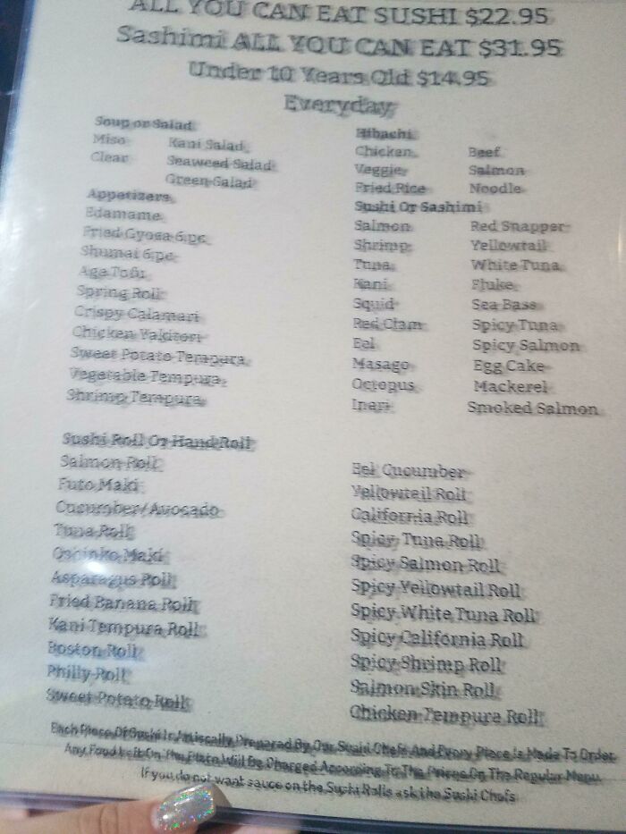
USB roll
When you see photos on a menu, you expect two things: to be enticed and to be sure that the picture is an accurate representation of the food that will be served to you. But sometimes, some restaurants just don’t have the budget for a full-blown photoshoot.
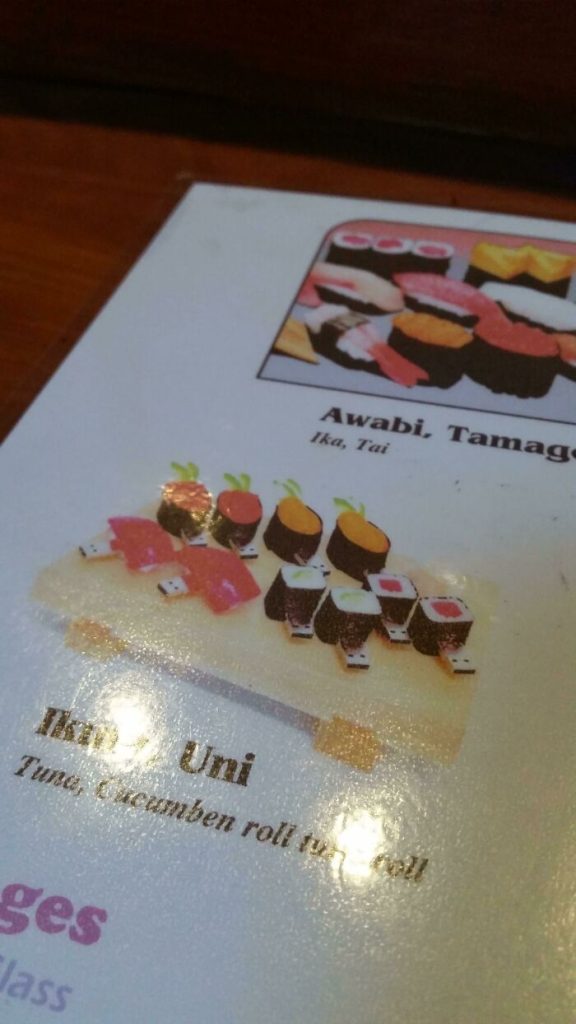
Clearly, this Japanese restaurant typed “sushi roll” into Google and used whatever image they found there. Nobody realized that the photos were of USBs shaped like sushi rolls! We hope that’s not actually what we would eat if we visited.
Translation: huh???
To make their menu accessible to all, some traditional restaurants include English translations of their food so that people understand what they’re eating. It’s all well and good, as long as the menu is translated correctly. We’ll accept something kinda close.
What are we supposed to make of this? They probably just mashed the keyboard and hoped for the best. Google translate might not be the best, but it would have helped in this situation. Hey, at least the picture is clear.
A big jumble of nothing
We understand that menus need to be appealing, but it seems like this café forgot that menus also need to be legible. How is anyone supposed to order anything from this rainbow text on the wall? We see some flavors of tea and coffee, but that’s it.
A simple fix to this menu would be to just use a single color for each section – one for drinks, one for food, one for extras. We like the idea, and we just want to see it executed well.
Clever food design
We’re not sure if this is supposed to be a fail because there doesn’t seem to be anything wrong with this menu. It’s just that the rice on the dish is shaped like an airplane, probably because it’s an in-flight dining menu.
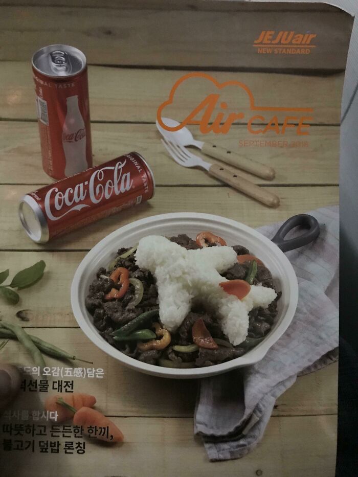
If anything, the airplane-shaped rice is suited for the occasion. We assume that this menu is a fail because someone ordered this particular dish, and the rice didn’t come in an airplane shape. (Okay, okay, we know. The placement of the carrot is what’s hilarious.)
Assassin’s Menu
Just five menus in, and we’ve already seen two menus with a photo that is completely unrelated to the advertised food. This menu in a restaurant in Florence, Italy was printed against a background photo that isn’t exactly welcoming to guests.
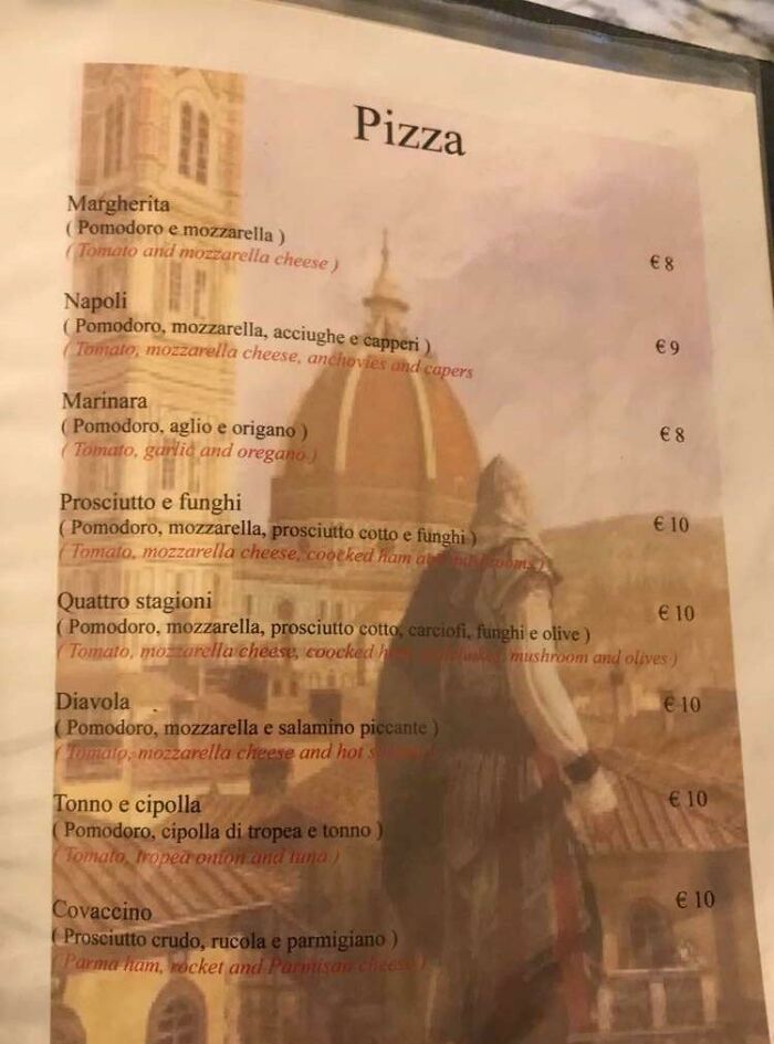
Can you recognize what it is? Yup, it’s a still from Assassin’s Creed. Sure, maybe those buildings and domes are set in Italy, but maybe try a photo of a table full of pizzas for your pizza section? But no one asked us.
Not up for cat
This was found in a Thai restaurant claiming to serve “amazing Thai cuisine.” But nothing can prepare you for what is on the cover of the menu. In addition to a generic cursive font, there are squished photos of sad-looking cats.
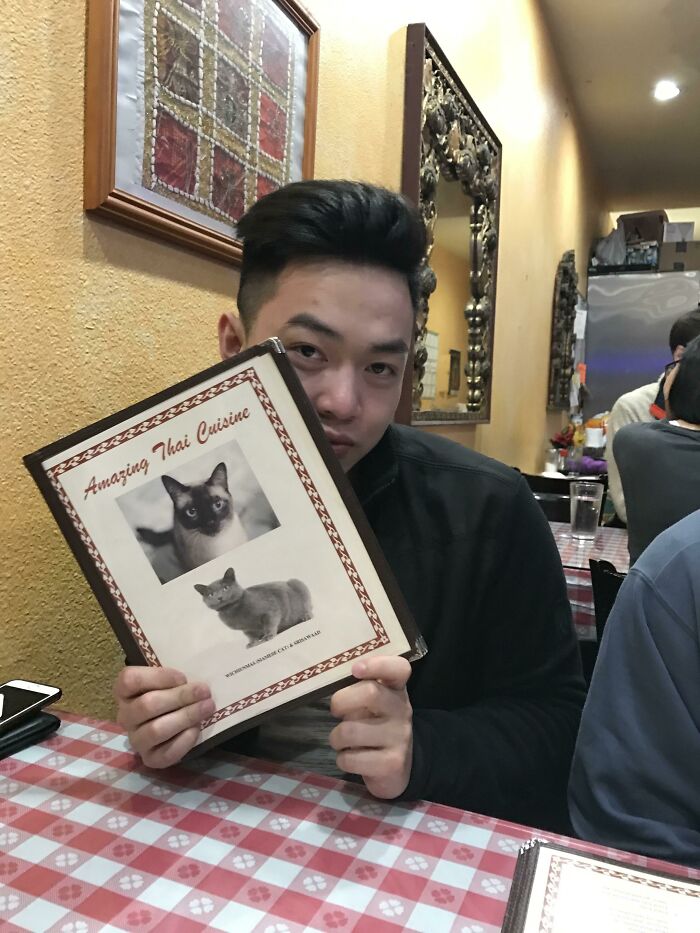
These are clearly photos taken off Google and pasted onto a Word document. A menu like this signifies that the place either serves cat food or uses cat meat, neither of which is appealing to human customers. Show us some tom yum goong!
The same salad
Just in case some customers come in on a health kick, Subway serves salads in addition to their sandwiches. But one look at this menu and you’d think they only serve one kind of salad. The culprit? Copy and paste.
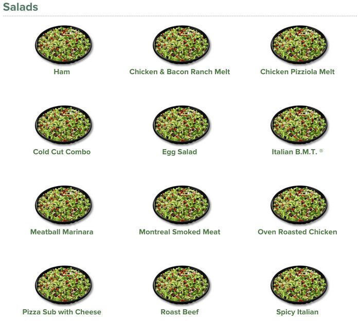
Whoever designed this menu, which we’re going to guess is on the website, basically just used the same photo of a salad and changed the name. While we know an egg salad looks nothing like spicy Italian salad, we kinda get it. Salad is salad.
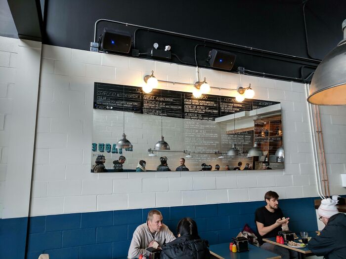
Aesthetics
Putting a menu up on the wall behind the counter is supposed to make it easy for customers to read. Those waiting in line can browse the options, and by the time it’s their turn to order, they don’t spend too long thinking about what they want.
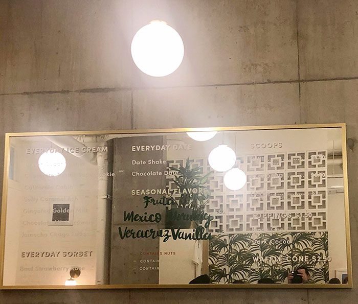
But if the menu is printed onto a mirror, it makes it difficult to read. All you see is just the reflection of what’s in front of it. The bits that reflect a wall are fine, but everything else is completely illegible. Aesthetics, yes. Readability, big no.
Eye check
Have a look at this menu below. Do you feel like your eyesight has worsened? Or are you blaming the photographer for taking a blurry photo? Well, plot twist. Your eyes are fine, and the picture isn’t blurry. This is just how the menu was printed.
Clearly, the printer was having a hard time. It was either running out of ink or just on the brink of death. Sure, we can still make out what the text says, but we hope the other menus came out better.
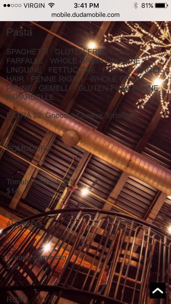
White on black
There is a reason why both HVS paper and word processors have a white background. It’s easier to read a dark-colored text on a light background than the other way around. Whoever designed this menu did not think much about this.
According to this Reddit post, the waitress literally said, “you’ll need to use the flashlight on your phone to read the menu,” when she was handing them out to this table. If you have to work to read the menu, surely the food is worth it?
Where’s the menu?
It’s very common for restaurants to publish their menu online so that potential diners can scope out the price range and food variety in advance. But just because it’s an online menu, doesn’t mean people don’t hold it to the same standards as physical menus.
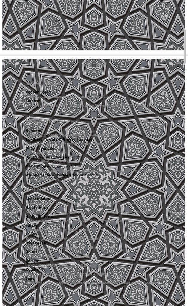
Not only is the background pattern distracting, it’s also the same colors as the text, making everything difficult to read. Can you make out the words on this menu? We can read, like, half. We might still visit to find out about their mystery food.
Floating peas
When taking photos for a menu, restaurants want to present the food accurately. Yes, down to the very last leaf for garnish. Maybe the photos look a little better than the real thing, but that’s expected. But what happens if you forget a few elements?
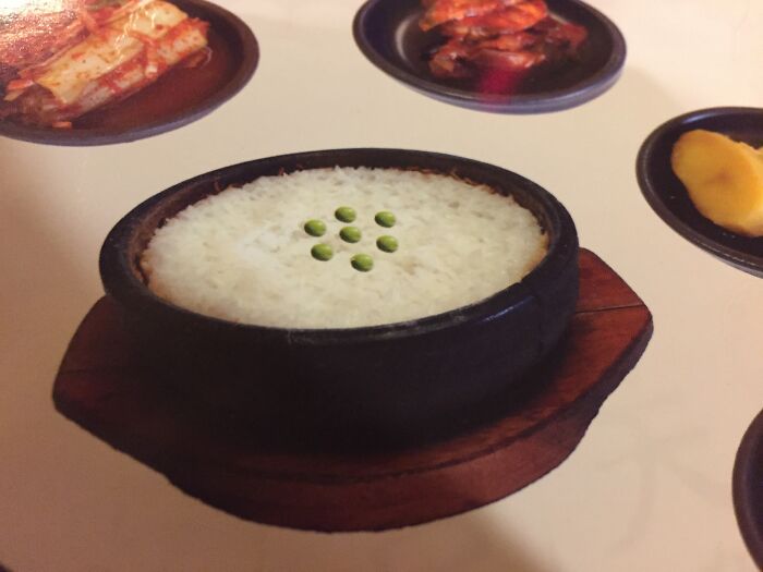
Of course, with the magic of Photoshop, you can do anything to pictures these days. But just make sure you get a good graphic designer. Otherwise, your peas will look like they’re floating over the rice like weird spherical UFOs.
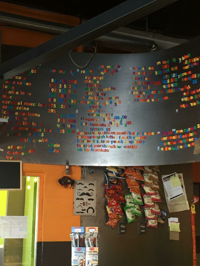
Loud menu
We can just imagine walking into this next ice cream shop and being hit in the face with all these menus. They are all over the place – covering the walls, on top of the counters, and even on the display glass.
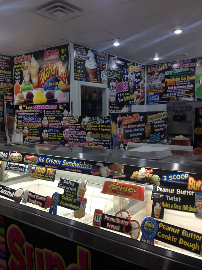
There’s the abundance of 90’s font in multiple different colors. Something about this image is just so overwhelming that we don’t know what to focus on! Imagine having decision anxiety and having to make a flavor choice in this shop.
Knocking back condiments
A fun thing to do before printing out a menu, whether it’s a small one for the table or a large one for display, is to triple-check it. Check for spelling mistakes, formatting errors, and even major errors like this one.
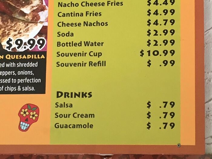
We’re pretty sure that heading isn’t supposed to say “Drinks.” Unless, of course, this restaurant has managed to incorporate salsa, sour cream, and guacamole into signature restaurant drinks. Otherwise, someone should probably change that heading into “Add-ons” or “Condiments.”
Menu stick
Most restaurants have menu books. Others have one-page laminates. Still, others that are trying to stand out amongst the competition have menu sticks. Why not? It is not the most useful, but it probably gets people talking about the place.
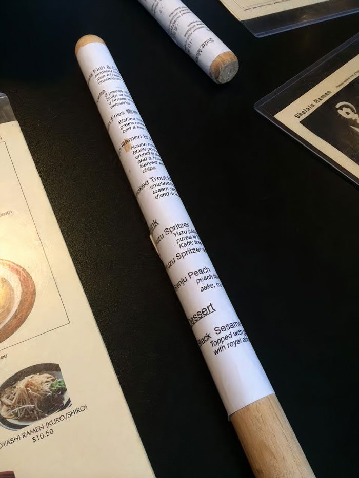
Now we’re not sure if it’s possible to unwrap the menu from the stick, or if you just have to roll the stick around in order to read it. We’d love to see Gordon Ramsay review this menu on an episode of Kitchen Nightmares.
What am I looking at?
We thought we’d seen the most interesting menus there ever were, but nothing could have prepared us for just how odd this next one is. It is so confusing. We have an idea of what we’re looking at, sort of.
If the menu on the screen is outdated, the least they can do is turn the screen off and then put the new menu over it. But even then, we’re also not impressed by the design work. But it’s these weird places that sometimes have the best food, right?
Pirated menu
Looking at this menu, it seems that the restaurant is sea-themed, or more specifically pirate-themed. That’s all well and good, until you notice the photo of the cute little pirate ship sailing along at the very bottom of the menu.
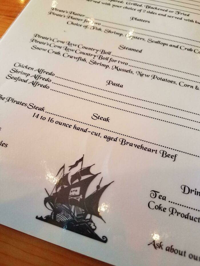
If you’re familiar with this logo, then you’ve been a very good internet user. Others will know this is the logo for the notorious pirating site, Pirate Bay. The restaurant pirated the Pirate Bay logo for their menu — the irony!
Inspirational menu
When you hear the words “five-star restaurant,” you think suede seats, fancy cutlery, waiters in tuxedos, and leatherbound menus. The last thing you’d expect is a menu with a bunch of inspirational quotes scattered around the back. Wait, these are puns!
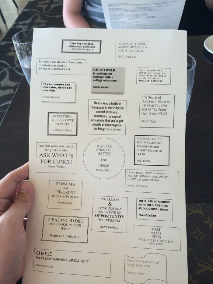
It’s not that this is a bad idea. It’s just poorly executed. With the differing fonts, the inconsistent frames, you can just tell this was done on Microsoft Word. We all love a good cheese joke, but we love them more when the layout is nice.
Unfortunate placement
Restaurant menus rarely have photos of the chef on them, aside from when it’s a family chain and the menu has a page dedicated to the restaurant’s history. We are pretty sure that’s not the case with this next menu.
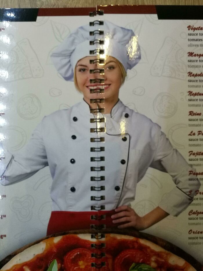
We’ll bet you anything that this photo is a stock photo off Google. The placement of the chef is also unfortunate, because the binding down the middle makes it look like she’s just gotten out of surgery with multiple stitches and an extra half of a face.
Fail
The letter F is not something that you want to see on your homework, tests, or report cards. Who knew that it would have the same negative connotation when placed on a restaurant menu? Especially if said menu was taped to the front-facing window.
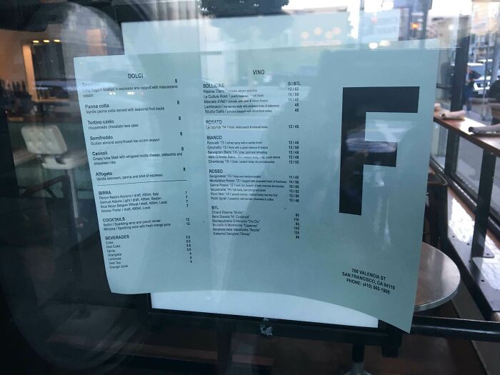
This just looks like a health inspector came in and decided to give this restaurant’s overall health and hygiene an F. It’s like a warning for passersby not to go inside. The manager could do the restaurant a favor and fold that part of the menu inwards.
Sample Text
Menu templates are readily available online to make the process of designing it simpler. We understand that not every restaurant can afford a graphic designer, so using a menu template is a safe, affordable option. Even Word has an option.
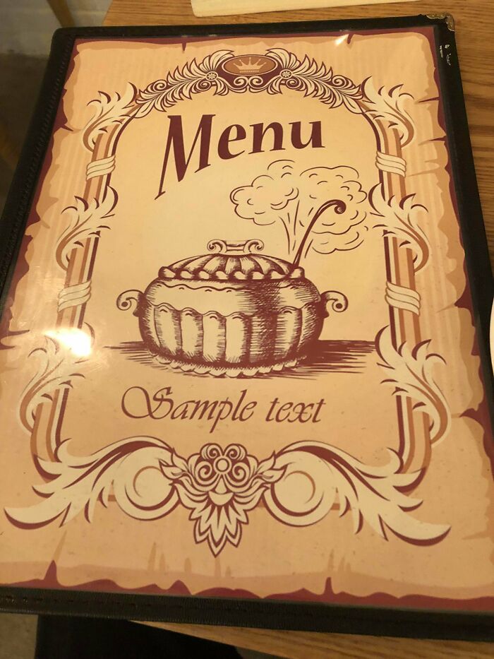
Unfortunately, this restaurant forgot to replace the sample text with the name of their restaurant. But wait. What if the name of the restaurant is actually Sample Text? It’s not a very catchy or memorable name, but it is effective.
What am I looking at, part 2
Dear Lord, help our eyes. We can’t even pick out the restaurant’s name, let alone where the actual list of food and drinks is located. There are so many fonts on this page, so many different styles. They really got creative here.
It looks like the restaurant was trying to fit everything they had into one page to cut printing costs. We get that, honestly. This reminds us of those mom-and-pop places that have the best food but didn’t waste resources on aesthetics.
Menu essay
A menu should be clear, brief, and enticing. There’s no need for too many words, especially flowery ones. Descriptions of food items should be kept short. Otherwise, it’s not a menu; it’s an essay you have to turn in for school.
Sure, the bold text helps make the actual menu items stand out on the page, and it isn’t actually that wordy. What they needed was a little bit of white space so we can determine where one description ends and another begins.
Is this a menu or an eye test?
Some of these previous menus we’ve seen really make you feel like you’re doing an eye test at the optometrist. But this next menu literally looks like an eye test!. Have a look for yourself. This one is pretty cute.
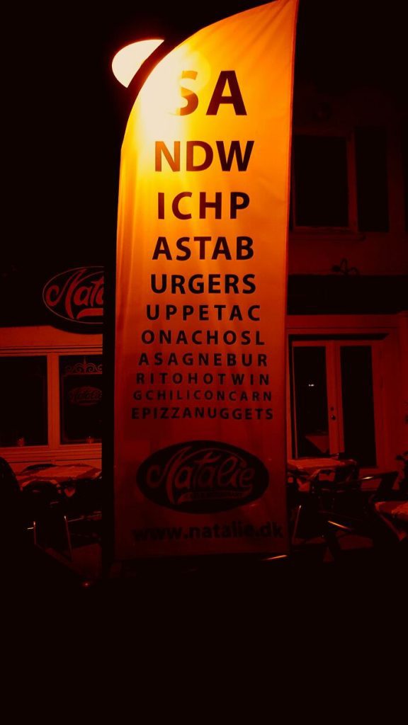
Can you make out what this flag is trying to say? Imagine trying to order your food like, “Hello, can I get an Astab with a side of Epizzanuggets and two Onachosl, please.” Okay, we doubt anyone does that, but we imagine the joint gets jokes from customers.
Where’s the menu?
This is so poorly designed that it’s got us wondering whether we’re actually looking at a menu or a picture of the ceiling. One reddit user shared this online menu for a restaurant that they didn’t end up going to, for obvious reasons.
The text is so dark that at first, you’re not even sure it’s there. And can we talk about the background? Is this the restaurant’s interior? If so, is there not a more flattering angle? Maybe it’s too artsy for us, and we just don’t “get” it.
Cereal menu
If you’ve been to London and haven’t visited the Cereal Killer Café, have you really been to London? Trick question; the answer is, it doesn’t really matter. But we’ll take you on an inside look to one of London’s world-famous cafes on Brick Lane anyway.
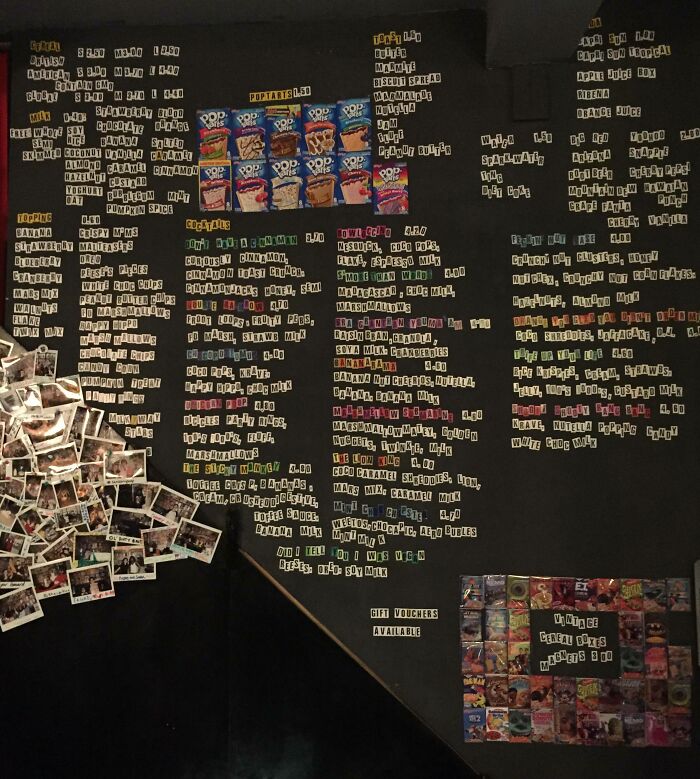
Naturally, because it is called the Cereal Killer Café, the menu is printed in anonymous note style, making each letter look like it was torn out of a magazine. We’re not sure if it’s just the photo or the actual menu, but it is tough to read!
Orientation mix up
When designing a menu, you should note what orientation it needs to be in — portrait or landscape? This is especially important for a display menu because you need to make sure it will fit the board or screen and advertise your restaurant well.
What are people supposed to do here? We can all tilt our heads 90 degrees to be able to read this menu. It’s not like you can turn the screen sideways. Judging by the Reddit thread, how you display your product might make or break the business.
Handwritten menu
Creating a handwritten menu can give it that authentic, independent vibe. If this is the mood you want to make in your restaurant, then go for it. The only thing to be mindful of is your penmanship and the spacing on the page.
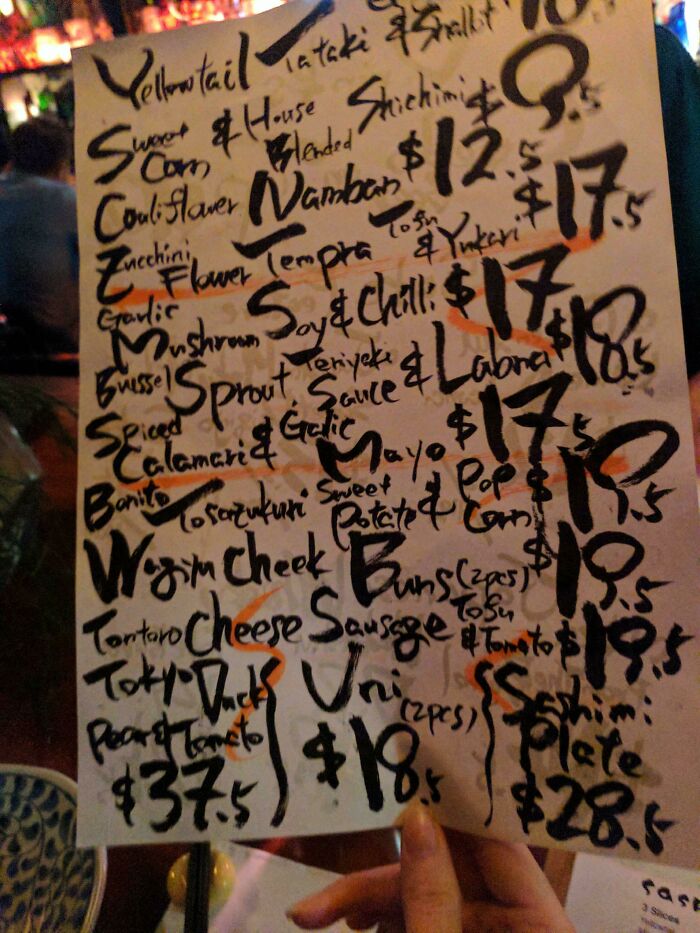
You want your menu to look authentic but still readable, and most importantly, understandable. This menu’s food section and price section bleed into each other that we can’t tell which items cost how much. Well, they definitely saved some money!
No point in going digital
Digital menus are great for restaurants. They can be designed interactively with slideshows instead of just a plain image and text. They are also bright and catch people’s attention. But this next restaurant had some technical difficulties with their display.
Instead of putting it in the budget to fix their digital menu display, they simply took a photo of their old menu and placed it on the screen. Whatever works, works, if you ask us. We imagine they get the same customers as always.
Soft drinks
Most menus show photos of only their food. Others include pictures of their signature drinks, which makes sense because people might be unfamiliar with those. But it really is not necessary for the menu to include photos of soft drinks.
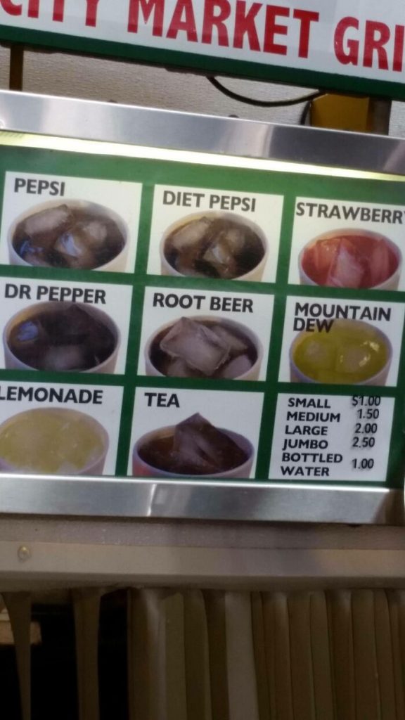
Yeah, it’s great that this restaurant serves a wide variety of soft drinks. But we think everyone knows what a Pepsi, Dr. Pepper, or a Lemonade generally looks like. You have to admire their thoroughness, though. This is next-level dedication.
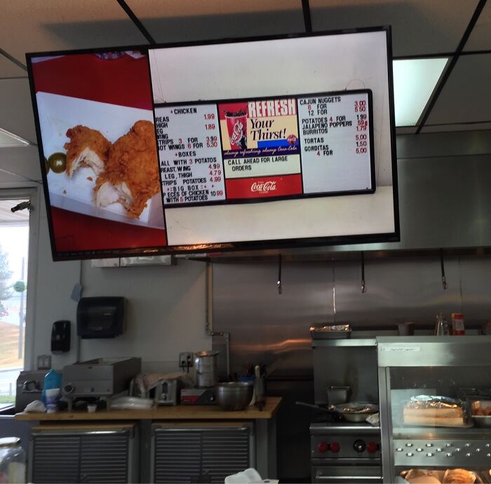
Is this a menu or a novel?
Some menus try to fit all their items into one or two pages. Others who can afford production and printing cost will fit each item into one page. The result? One is a two-page essay, and the other is a novel.
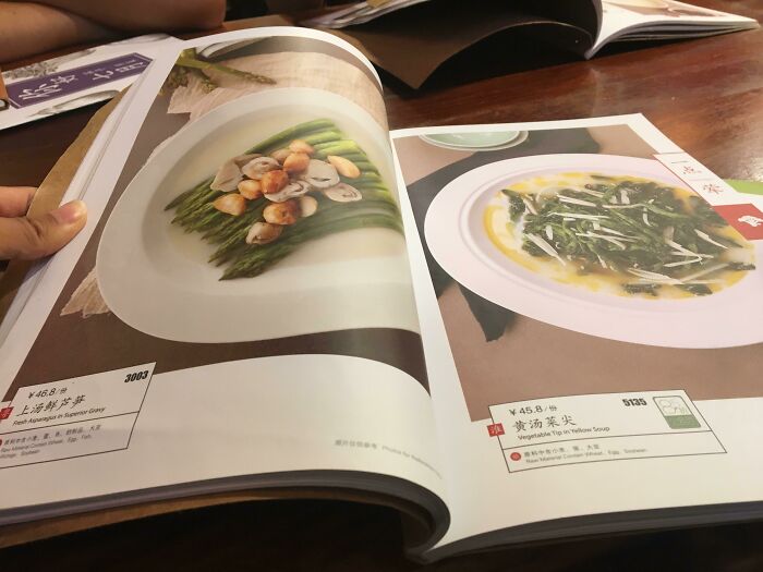
Sure, this menu allows guests to really take in the visuals. It also seems that the photos on the pages are accurate to what will be served. But we can imagine people would be tired of browsing before they even get halfway through.
Free food
This local McDonald’s is just waiting for a stampede of people to show up at their door. Once word gets out that they’re serving 3 out of 4 breakfast menus for free, everyone is bound to take advantage of it.
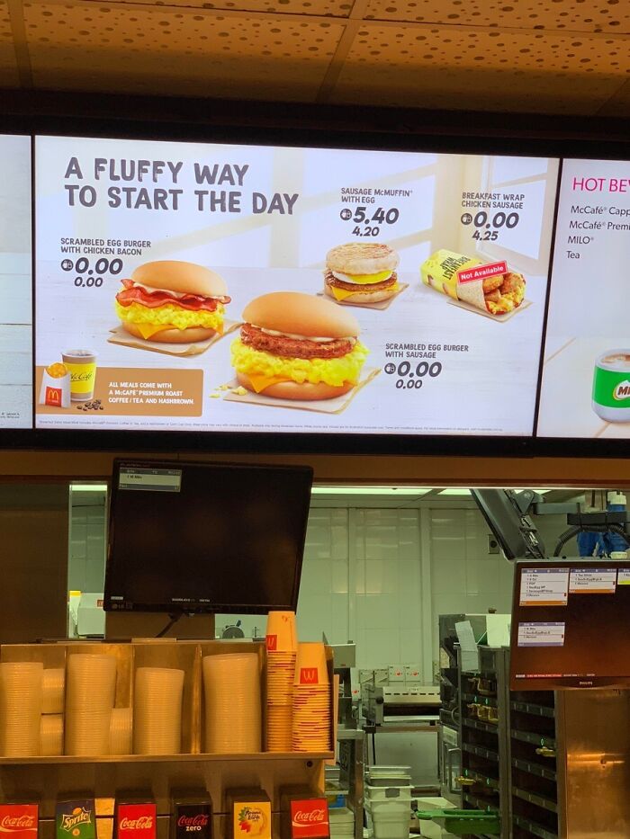
Maybe they just forgot to put the price in for those items. Or perhaps they are selling for free. Someone should order a scrambled egg burger with chicken bacon and complain when they get charged for it. “Your menu literally says it costs $0.”
More mirror menus
We understand that mirror menus give a place a little bit of oomph. It’s aesthetically pleasing to have nice handwriting on a mirror. But it’s not very functional. Restaurant owners should rethink this before going ahead and spending a lot of money on a mirror menu.
If you’re adamant about getting a mirror menu, make sure the placement of the mirror is ideal. Placing it across a plain wall might make it easier to read. The choice of color for the writing is also crucial. Pick the wrong shade, and no one will be able to read it.
Invisible ink
One day, this Reddit user felt like dining out. Like any other person would, they looked up a few restaurants, found Bravos, and perused the menu available online. But lo and behold, they discovered half the menu was written in invisible ink.
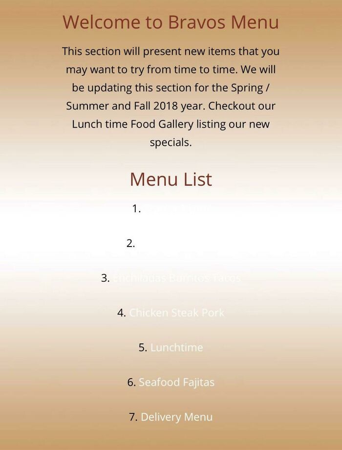
Just kidding! It’s just a totally unwise usage of background color and text color. We don’t know why the numbers are in black, but the text is in white. This could have been easily fixable if they had made them the same color.
The same pizza
Have you ever been to a restaurant that only served five items? Some people prefer it this way because it limits the options and makes it easier to decide. It seems like this restaurant is trying to cater to that crowd.
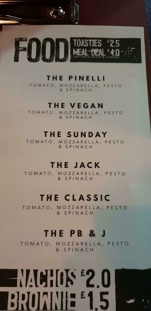
But mistakes were made because each choice has the same description. We bet at this point it’s a joke amongst the regulars. And newbies would be clued in when they read that the PB & J has tomato, mozzarella, pesto, and spinach.
Restaurant Logo Here
Here’s another menu where the designer has failed to replace the placeholder text. Unfortunately, it is where the name or logo or the restaurant should go. So we are not actually sure what the name of this restaurant is.
What are the chances that the name of the restaurant is actually Restaurant Logo Here? Pretty slim, we know. It’s just such a shame that they could have had their restaurant name in beautiful silver on black leather, and they missed that opportunity.
Bad copy paste job
Some menus include a brief description of the origins of their food. This is especially true when the restaurant serves foreign cuisine. Take this Korean restaurant, for example. They included a short paragraph describing a dish called Bibimbap.
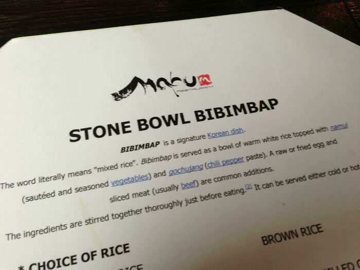
While this paragraph is informative, it is also very obvious that they just copy-pasted the information from Wikipedia… right down to the hyperlinks and footnotes left in there. Not a great look for a physical menu to have links on them.
Poor pizza
Images matter just as much as words in visual communications. In fact, the graphics you choose convey more than the words ever could. When you as a customer see this photo of a terrified-looking pizza, what conclusion would you draw?
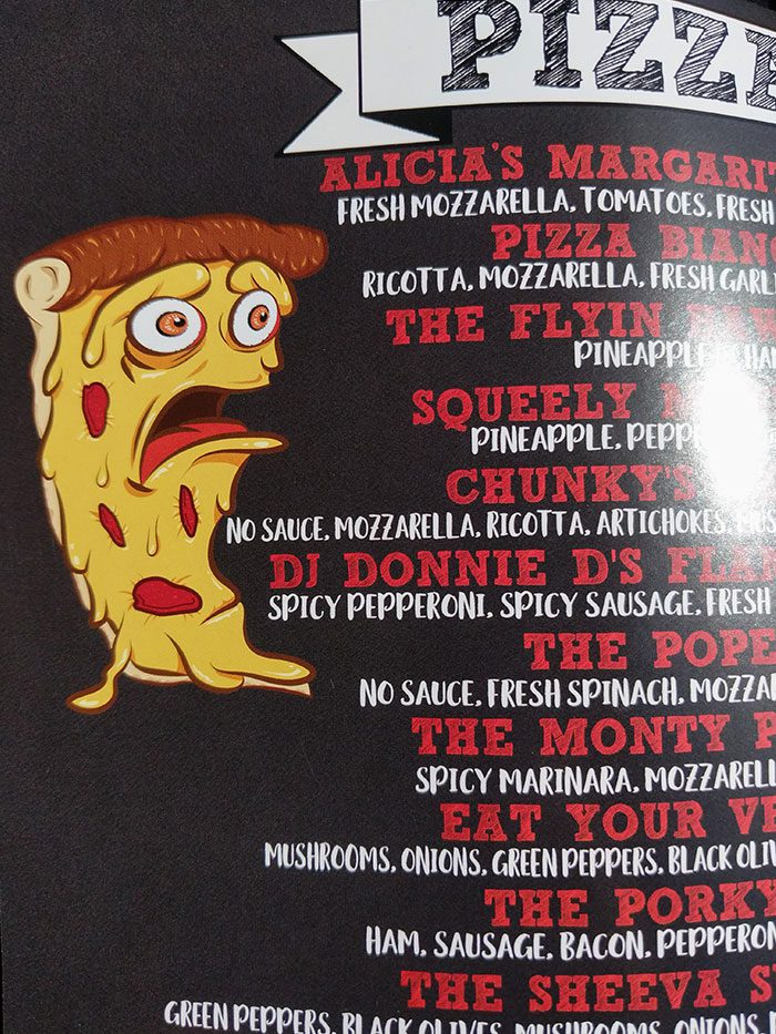
The pizza looks like it’s reading the menu, because it’s facing the text. It also looks like it’s absolutely horrified by it, as if the menu is some sort of atrocity. Maybe it’s scared that its family will get eaten? But it’s a pizza, so… we’re not sure.
Mirrored
Right. Here’s the thing about menus in general. People want something that’s easy to digest (haha). They don’t want to have to read through huge blocks of text, and they certainly don’t want to be reading something from right to left.
This is clearly a printing issue, but instead of fixing it, this McDonald’s just decided they’d make their drive-thru customers work for it. It is probably safe to say they are super glad they have pictures next to each item.
Capitals everywhere
Okay. This next menu fail might actually be an artistic choice, but the only thing we’re hearing in our head is that one SpONgebOB mEmE tHAt GOeS liKe thIS. Not exactly detrimental to the restaurant’s reputation, unless their customers are well-versed in internet memes.
In addition to the text looking like a meme, the scattered capital letters everywhere are also an eyesore to look at for too long. If we were at this restaurant, we’d just get the nachos and call it a day if it means not having to look at the menu for longer.
Censored salad
We appreciate when menus come with photos because it helps us know what to expect from the food. But if said photos aren’t actually clear to look at, then what’s the point? Like this photo of a chicken salad, for example.
It just looks like they’ve censored everything on this salad, as if there’s something in it that we shouldn’t be seeing. This has us worried. This was probably printed a while back, and we bet the updated version will have proper image sizes.
Should we phone HR?
Um, did we just get lowkey harassed by this menu? We’re not sure, since we’re also unclear as to what this piece of quote on the menu of this Mexican restaurant means. It’s probably meant to be funny, but it’s just a bit meh.
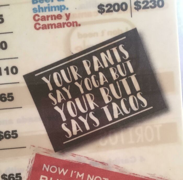
The more we think about it, the more we realize they’re right, and that’s why we don’t like it. It isn’t the most classy thing to put on your menu, that is for absolute sure. There are, thankfully, plenty of Mexican restaurants we can patronize.
Can anyone read this?
One of the basics of designing for communication purposes: dark font on a light background, light font on a dark background. Otherwise, no one’s going to be able to see what you want to say! Why are so many menus making this rookie mistake?
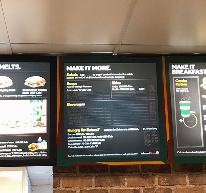
Does anyone have any idea what the soup options and beverage options are in this Subway? Or are we going to have to just get tap water? Also, how much do the cookies cost? Cause the prices are practically invisible too.
Fish cake?
We’re not sure what’s weirder on this menu, the typo on “chocolate fudge,” or the fact that the chocolate fudge cake is all the way down there in the Fish section. It’s funny either way. Good job to the person who spotted this.
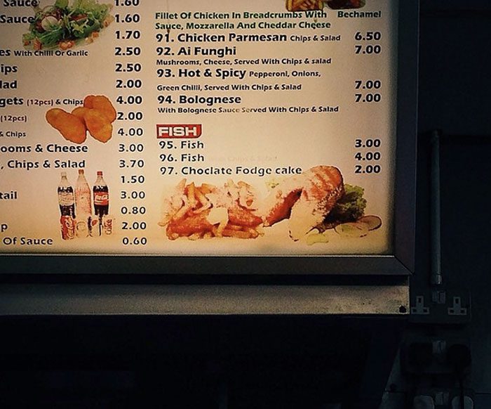
The chocolate fodge cake is probably positioned there because it’s a dessert item. Makes sense that desserts would be at the end of the menu. But it looks like it’s the only dessert item. Maybe it would have looked weirder to have a desserts section with only one item.
Poo on the menu
As menus are supposed to promote food, the last thing you would want to see on one is any reference to the end product of food once it’s passed through the digestive system. But this one menu completely disregarded that.
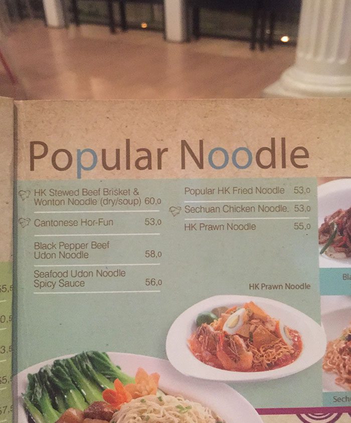
We don’t know why the words “Popular Noodle” had to be written in different colors. It’s such an awkward thing to do, to change the color of only one or two letters of a word. The blue letters clearly spell “Poo,” and now it’s all we can see.